Lucid Signing
BrandGuidelines
One wordmark, two typefaces, one blue. Everything the brand needs to represent us accurately, and nothing it does not.
- Version
- 2.0
- Issued
- August 2026
- Accent
- One signal blue
- Typefaces
- Fraunces and Poppins
Foundation
What the brand is made of, and who may use it.
Purpose
The Lucid Signing name and wordmark are trademarks owned by Bonang Technologies. This page sets out how customers, partners, developers and journalists may reproduce them, so that every appearance of the brand reads as the same company.
Treat what follows as rules rather than suggestions. If a use you have in mind is not described here, it is not yet approved. Ask us before you publish.
The system
The system is deliberately narrow: one wordmark, two typefaces and one accent. That restraint is the identity. Ink on cool mist paper carries the whole brand, and signal blue is spent only where something is meant to be done, which means the document in front of the reader never has to compete with a palette.
Nothing in the system is decorative. If an element is not doing a job, it does not belong on the page.
At a glance
Logo
One hand-lettered wordmark, set in a single ink. The only element that stands for the company.
Meaning
The wordmark is a picture of a signature: five letters written rather than typeset, each with its own tilt, scale and baseline, and each drawn as two or three overlapping strokes so the line swells and thins the way a real pen does. The trailing hooks are pen-lift marks and they stay.
It is supplied as finished vector artwork. It is never redrawn, re-spaced, or rebuilt by setting the name in a font. There is no icon-plus-name lockup: if you are showing the brand, you are showing the wordmark.
On a ground
Signal blue on light grounds, white on dark, and ink where a single colour is all the process allows. Never two colours, never a gradient, never an outline. It ships as SVG, so scale it rather than exporting it to a bitmap.
Clear space
Keep a margin of half the wordmark height, shown here as x, on all four sides. Nothing enters that zone: no type, no rules, no other logos, no edge of the page. Because the measure is the mark itself, the rule holds at every size.
Minimum size
24 px tall is the floor. Below it the overlapping strokes close up on one another and the letterforms stop reading, which is easier to see than to argue about.
Construction
Colour
Mist paper, ink type, one signal blue. There is no second accent, and one is never added.
Core
Click any plate to copy its value.
Ramps
Blue
500 is the brand. 600 carries small text and links; 50 to 200 wash cards, chips and selected rows.
Surface
The paper stack. Cards are white, sections alternate haze and mist, and line draws every hairline.
Ink
One cool grey ramp does the structural work. 100 is Mist, so the ground is a step of the neutral scale rather than a colour standing beside it.
Contrast
Signal blue is bright, and bright blues fail against light paper. These four pairings are the ones that matter; everything else follows from them. If a combination you are considering is not here and does not clear AA, it is not a Lucid Signing combination.
White on Signal blue.
Signal blue on Mist. Large only.
Blue 600 on Mist.
Ink 600 on Mist.
Inside the app
Blue
#2F6BFF / #1F52D6
The in-app action. Sign, send, approve.
Red
#FE5858 / #C62B2B
Reserved. Reject, decline, void or delete, and never decoration.
Green
#1DA35A / #147A42
Completed and fully signed.
Amber
#E8A33D / #8F5E0F
Waiting, viewed or expiring soon.
Green, amber and red are status, not brand. They only ever appear where a document has a state to report, and never on a marketing page. The second hex in each pair is the darker one small text drops to, so the words clear AA on paper.
Typography
Fraunces speaks. Poppins works. Two families with one job each, and no third.
Weights
Drag to scrub the family, pick a weight, or switch to the display serif.
The pair
Fraunces at SOFT 100 and WONK 0 - a soft serif with the wobble turned off - carries every headline. Poppins carries everything else. Emphasis comes from size and colour, never from decoration.
Character
ABCDEFGHIJKLMNOPQRSTUVWXYZ
abcdefghijklmnopqrstuvwxyz
0123456789& ? ! @ # % ( ) “ ”
Poppins is geometric and near-monolinear, with a circular o and a tall x-height. It sets tightly at display sizes and stays even in a paragraph, which is the whole reason it does the working.
Scale
Sign faster
Sign faster
Sign faster
Sign faster
Sign faster
In use
Regular for body, Medium for subheads and labels, SemiBold for eyebrows, and Bold only where a single word has to carry a whole screen. Fraunces is for headings and nothing else - it never sets a paragraph, a label, or a button.
Tracking tightens as size grows and relaxes as it shrinks. Body copy is never set below 15 px, and no line of running text runs wider than 34rem.
Both families are open licensed and served from Google Fonts, so partners can set Lucid Signing materials in them without asking. Where neither is available, use the platform system sans and leave the headings unstyled rather than substituting a lookalike serif.
Elements
One blue pill, one white arrow, one asterisk. The furniture the pages are actually built from.
Actions
The loudest action on a screen is a solid blue pill with a white arrow dot docked inside it. Its quiet sibling is an ink hairline outline. One primary per view; if two things are competing to be the primary, one of them is not.
Ornaments
Signed and sealed
Sign fasterA six-point asterisk in signal blue heads every section eyebrow, and a blue underline marks the one keyword in a headline that carries the promise. One underline per headline, and never on a link - links are already underlined.
Surfaces
Cards are white on mist, not mist on white. Depth comes from the shadow and the hairline, never from a border in the accent colour.
Motion
Everything eases out and settles: cubic-bezier(0.22, 1, 0.36, 1), fast to start and slow to stop. Entrances are a small rise and a fade, never a slide across the screen and never a bounce.
Motion is a courtesy, so it always yields. Every animation on the site is off under prefers-reduced-motion, and every one of them is decoration that the page reads correctly without.
Application
The rules, shown rather than described.
The wordmark
Partnerships
Logo
Logo
Two marks side by side, equal optical weight, divided by a hairline. Neither sits inside the other and neither is scaled to dominate. Both spacings above are fixed, so do not set this by eye: the template is in the downloads, with the partner area marked. Co-branded artwork may say a service is integrated with, or available through, Lucid Signing. It may not imply endorsement or a partnership tier that has not been agreed in writing.
Naming
Company
- Lucid Signing
- Bonang Technologies
- LucidSigning
- LUCID SIGNING
- Lucid Sign
Product
- Lucid Signing
- signed with Lucid Signing
- the Lucid platform
- Lucid Signature
In a sentence
- sign with Lucid Signing
- sent for signature
- lucid it over
- Lucid-ed the contract
Written correctly these are trademarks; written loosely they become generic. The name is never shortened to Lucid on its own, and it is never used as a verb.
Voice
Four principles shape every word and every pixel, from a reminder email to this page.
Principles
Calm and considered
Cool mist paper, ink type and one blue that means go. Nothing shouts, nothing decorates for its own sake, and there is never a second accent competing for the same job.
One accent, used sparingly
Signal blue is the loudest thing on any screen, so it is spent carefully: the action you want taken, the link you want followed, the field waiting for a signature. Everything else is ink and paper.
Trustworthy
This is software people put their signature into. The brand should always feel safe, careful and free of anything that reads as a hard sell.
Plain-spoken
We write the way a good lawyer speaks to a client: clear, direct, no jargon. Plain English, honest pricing, and never a promise we cannot keep.
In practice
Blast your docs out in seconds!
Send a document for signature in under a minute.
Leverage our enterprise-grade platform
Every signature is backed by an audit trail.
Oops! Something went wrong.
We could not send that. Check the address and try again.
Unlimited signatures, forever free*
Three documents a month on the free plan.
Rules of thumb
Say the thing. A sentence that could be cut in half should be. Numbers beat adjectives, and a limit stated plainly beats an asterisk.
South African English, rands, and the ECT Act by name where it matters. No exclamation marks outside a genuine celebration, no emoji in the product, and no error message that blames the reader for what the software did.
Assets and terms
Every version of the wordmark in vector and raster, and what you agree to by using it.
Downloads
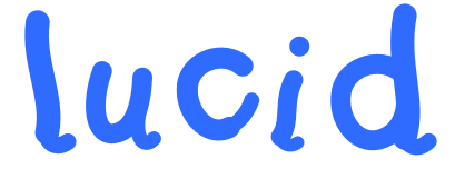

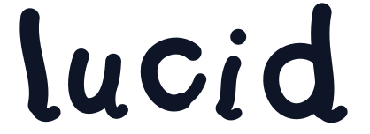


SVG is the master in every case. PNG is rasterised from that same vector in your browser at the width you pick, on a transparent ground, so it always matches the artwork on this page. Never upscale a PNG you already have; export a larger one instead.
On the partner lockup the dashed box is a guide rather than artwork. It marks where your own mark sits and the spacing either side of the divider; delete it before you publish. Send us the result for approval - see Contact below.
Provenance
All of it comes from one source. The wordmark on this page, the one in the navigation bar, the one on your invoices and the files in the grid above are the same set of stroked paths, so the artwork you download and the artwork we ship cannot drift apart.
Because it is drawn rather than typeset, it renders identically without any font installed. Favicons, email signatures and slide templates are issued on request.
Usage terms
The Lucid Signing name and wordmark are trademarks of Bonang Technologies. These guidelines grant a limited, revocable, non-exclusive and non-transferable permission to reproduce that artwork exactly as supplied, for the purposes described on this page.
- Do not use the wordmark in a way that suggests endorsement, partnership or affiliation that has not been agreed in writing.
- Do not use the wordmark, or anything confusingly similar, in your own product name, company name, logo or domain.
- Do not modify the artwork, including its colour, proportions and spacing.
- Do not pair the wordmark with content that is unlawful, misleading, or designed to disparage Lucid Signing or its customers.
- Do not present a document signed through Lucid Signing as having been reviewed or approved by us.
We may update these guidelines and may withdraw permission at any time. Where a signed agreement covers your use of the brand, that agreement governs and these guidelines supplement it.
Contact
For a use these guidelines do not cover, or for approval of co-branded artwork, write to info@lucidsigning.com. Send the artwork in context, since a flat file rarely answers the question on its own.
Journalists may reproduce the wordmark in coverage of Lucid Signing without asking, provided the artwork is unmodified and the story does not imply endorsement. For anything else, get in touch.
Anything else
© 2026 Bonang Technologies. Trademarks used under the terms above.
Version 2.0 / August 2026